By Adi Asskoumi, founder
How to Make a Michi Method Pokémon Binder
Some Pokémon cards deserve a whole page built around them. Perhaps it’s your favourite starter, a beautiful illustration you pulled unexpectedly, or a card that brings back memories of playing the games. The Michi Method gives you a way to make that card part of a bigger scene.
By combining real cards with printed artwork, you can turn a binder page into a woodland, an underwater world or a display dedicated to one Pokémon.
This guide walks you through making your first Michi Method Pokémon binder page, from choosing a layout to printing inserts that fit. Start with one page and cards you already enjoy collecting.
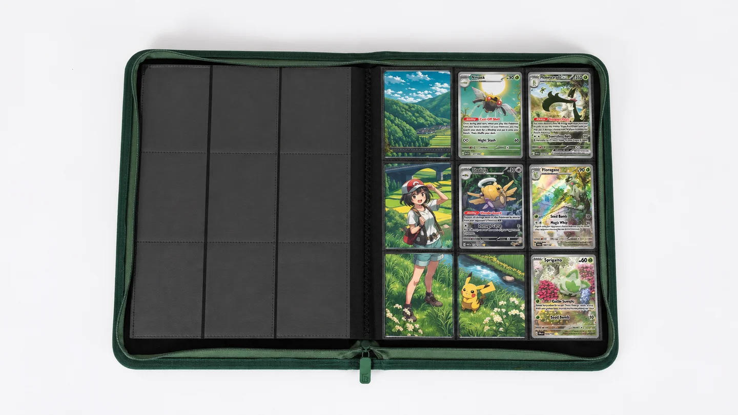
What is the Michi Method for Pokémon binders?
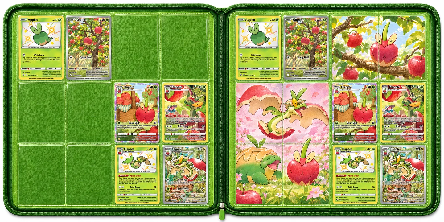
The Michi Method is a way of arranging trading cards and printed artwork so a binder page works as one visual composition. Some pockets hold cards; others hold pieces of an illustration, decorative backgrounds or other supporting images.
The approach is widely associated with Michi, known as @peeplop, who popularised it through binder layouts and tutorials. You can find their help resources through Michi’s own link page.
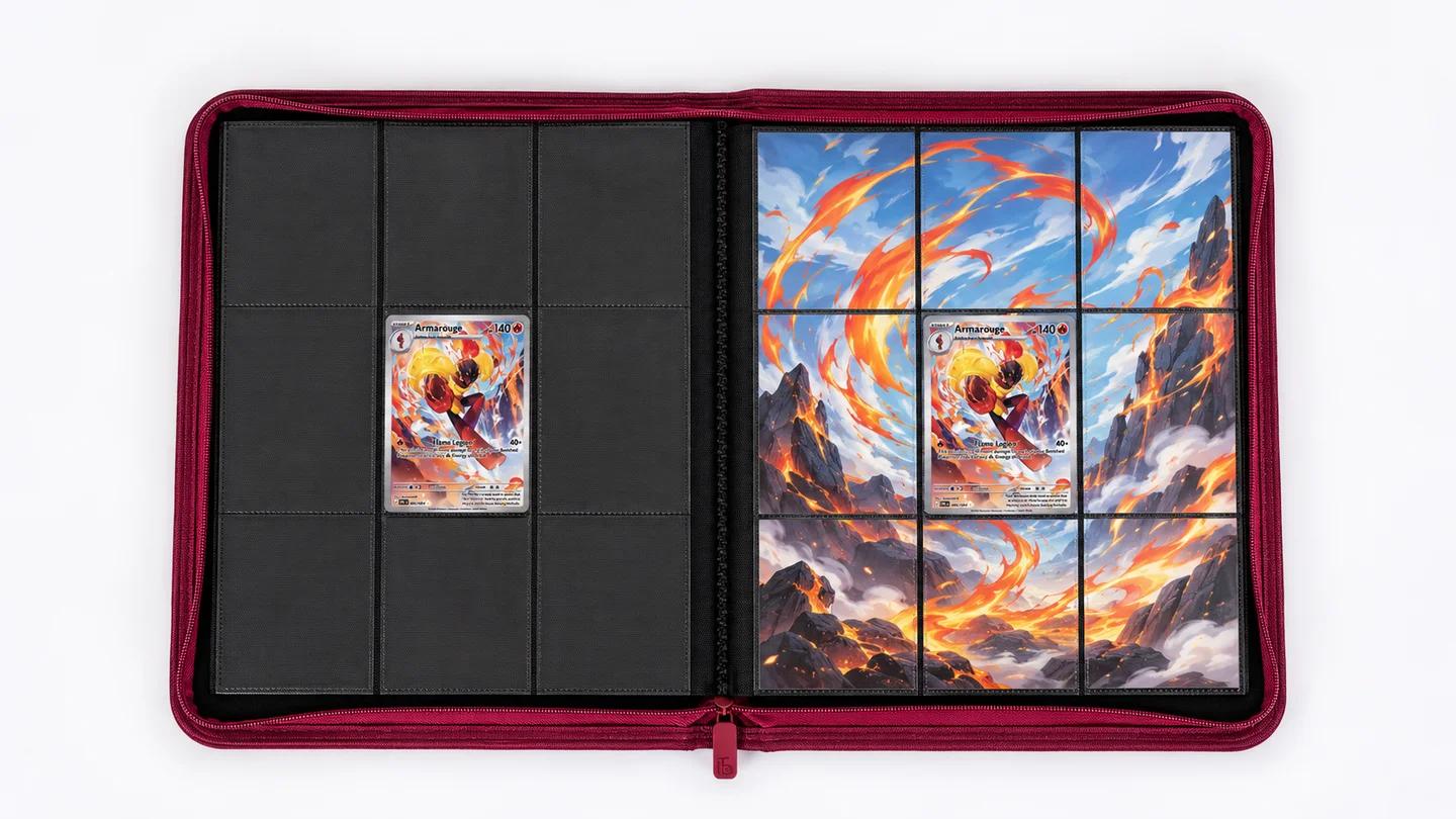
A simple example is one favourite card in the middle of a nine-pocket page, with eight artwork inserts surrounding it. A more detailed spread might mix several cards with scenery that continues across neighbouring pockets.
You’ll often see three terms:
- Focal or hero card: the card you want someone to notice first.
- Insert: a printed piece placed in a binder pocket.
- Art tile: one section of a larger image, arranged beside other tiles to build a scene.
There’s no compulsory number of cards, colour scheme or layout. You can use subtle backgrounds or fill most of the page with artwork.
It also doesn’t have to replace the way you collect. Keep your master sets in order and make a separate display section, or dedicate a binder to your favourite cards across different sets.
What you need before you start
You don’t need a collection of expensive chase cards. A few favourites and a clear idea are enough for a first attempt.
| Essential | What to look for |
|---|---|
| A trading card binder | Pockets that comfortably fit your sleeved cards and planned inserts. |
| Cards and sleeves | Choose the cards first; keep them protected while arranging the page. |
| Artwork | Your own illustration or photos, commissioned art, or material with suitable reuse permission. |
| A ruler | Millimetre markings make small size adjustments easier. |
| Paper and printing access | Use paper your printer supports, or ask a print shop about suitable options. |
| Cutting tools | Scissors work; a paper trimmer helps with repeated straight cuts. |
| A planning surface | Paper, a design app or a digital binder planner. |
An optional cutting mat and numbered layout sketch can make assembly easier. You don’t need specialist equipment to decide whether you enjoy the process.
Should you use a nine-pocket or twelve-pocket binder?
Both can work. A typical nine-pocket page has three columns and three rows, giving you an obvious centre pocket. A typical twelve-pocket page has four columns and three rows, creating a wider composition with two middle columns.
Choose the layout that matches your actual binder. A design made for nine pockets won’t automatically transfer neatly into twelve.
If you’re choosing a new cover to match your theme, explore the BindSafe Pokémon card binder collection. Plan around the pocket arrangement of the model you select.
How to make your first Michi Method binder page
For this walkthrough, imagine a woodland page with green-toned cards and a soft forest background. You can follow the same steps for an ocean, mountain or city theme.
1. Choose one theme
Start with a short description: “Pokémon in a quiet forest”, for example. That gives you a way to judge every card and image you consider.
Look at the backgrounds as well as the Pokémon. A card showing leafy scenery may suit the page better than a Grass-type card with a bright, abstract background.
Limit the first page to a small palette. Greens, warm browns and pale sunlight will be easier to combine than several unrelated colours.
2. Pick your focal cards
Choose the card you most want to display, then look for supporting cards that share something with it: a setting, colour, character or mood.
For a nine-pocket starter page, try one focal card in the centre. For twelve pockets, try a pair across the middle row. These are starting points, not rules.
Lay the sleeved cards beside each other before designing anything. Check whether one particularly bright card pulls attention away from the card you wanted to feature. You can move it, give it its own page or build the palette around it instead.
3. Map the card and artwork pockets
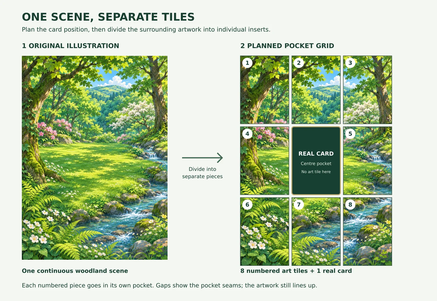
Draw the correct grid and mark each position “card” or “art”. This prevents you from designing a beautiful background only to discover that your favourite part sits behind a card.
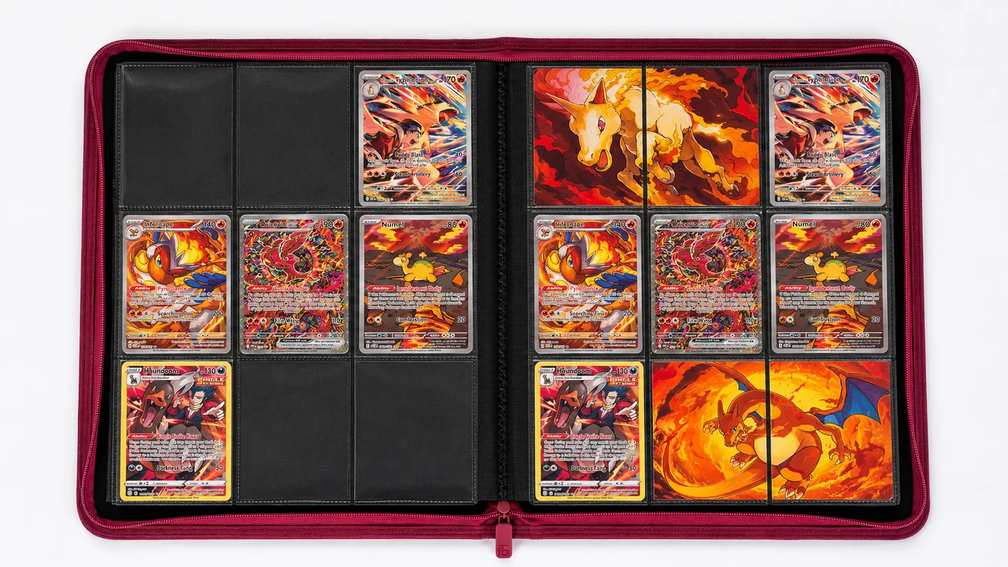
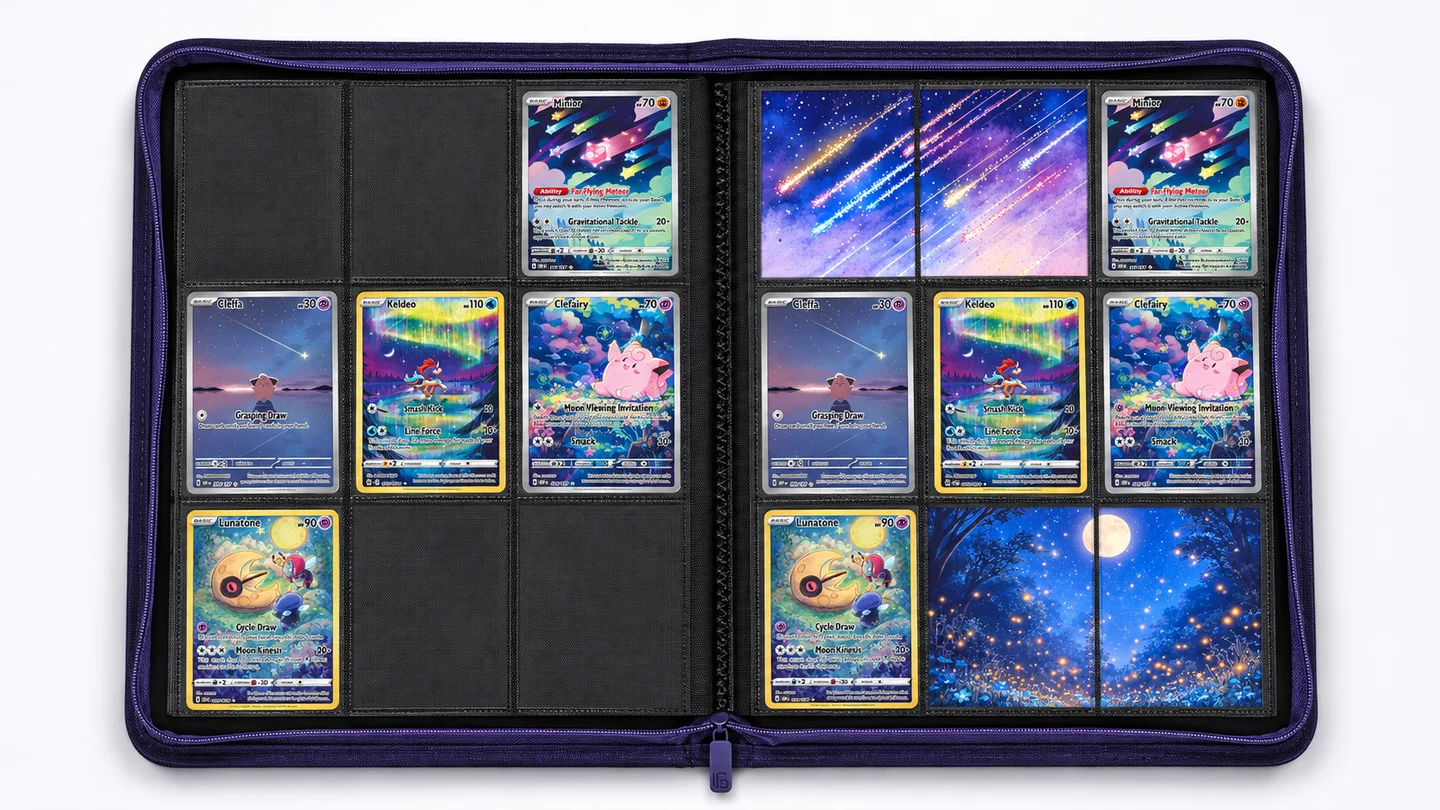
The examples below show different arrangements to try. On a woodland page, the artwork positions might contain sections of tree canopy, ferns and a path. Together, they establish the setting around the real cards.
Leave the composition simple enough that the cards remain easy to appreciate. A quieter background is often a useful starting point.
4. Prepare the background artwork
Choose an image with enough detail for the size you intend to print. For the woodland example, a continuous forest illustration can provide the background across the artwork pockets.
Place your card positions over the image in your planning file. Adjust the scene until the visible sections make sense: a path might lead towards the focal card, while darker foliage frames its edges.
Keep important details away from pocket seams. A tree trunk can tolerate a small visual interruption more easily than a face or tiny piece of lettering.
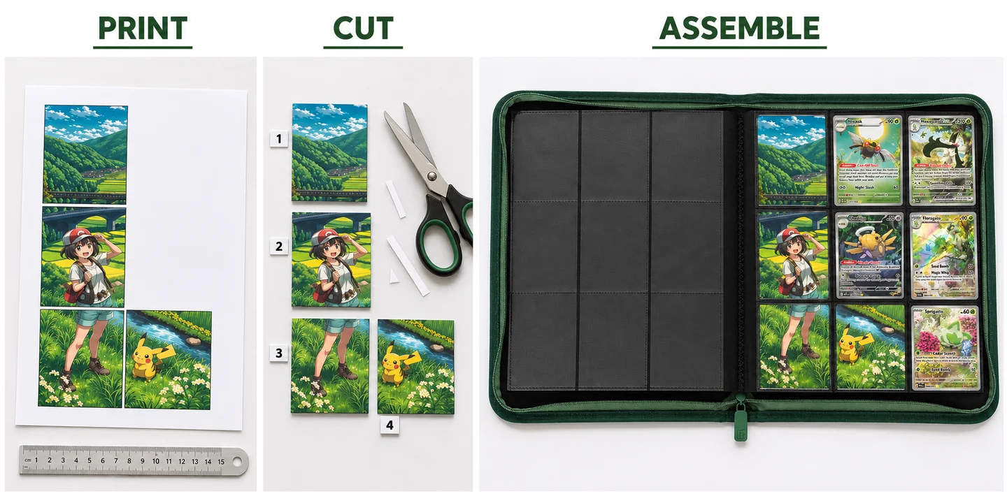
For this beginner project, use separate printed tiles in separate pockets. You don’t need to cut seams or alter the binder.
5. Print one test insert
Before printing the full design, make a plain-paper size test. Fit it into the intended pocket or sleeve, depending on your chosen setup.
It should slide in without force and sit flat. If it catches at the opening or bows, make it slightly smaller and repeat.
Then print one artwork tile to check colour, sharpness and scaling. This small test is much easier to adjust than an entire finished page. The sizing section below explains what to measure.
6. Cut and assemble the page
Cut on a clean surface, keeping your cards away from the cutting area. Lightly number the backs of the inserts so you can match them to your plan.
Arrange the cut pieces on the table first. Check that the image runs in the correct direction and that no tiles have swapped places.
Once the prints are fully dry, place the artwork in its assigned pockets and add your sleeved cards. Keep the artwork in separate pockets for this starter layout; there’s no need to stack extra paper behind the cards.
7. Check it in the binder
View the page upright and from a little distance. Is the focal card easy to spot? Does the artwork flow across the pockets? Do the colours feel connected?
Turn the page and close the binder normally. Nothing should need forcing. If a tile looks awkward, adjust that part of the file and reprint it. Your first page is a starting point you can refine.
Michi Method insert sizes and printing tips
The most useful measurement is the one that fits your own setup. Card dimensions, sleeve dimensions and usable pocket space are different things.
An insert designed to sit inside a sleeve needs to fit that sleeve. An unsleeved decorative tile intended to fill more of a pocket may need different dimensions. Neither approach gives you a universal size for every binder.
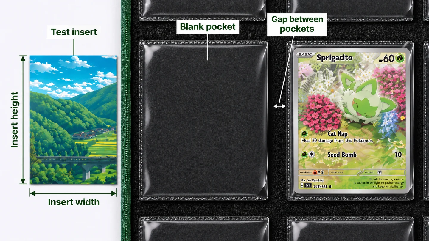
Measure the space you will actually use
Check the pocket opening and usable internal space without stretching the plastic. Make a paper rectangle slightly smaller than the available space, then test the fit. Repeat for a sleeve if you intend to sleeve the artwork.
Record the size that slides in comfortably. Use that measurement in your design file and keep the paper test as a reference.
| Measurement | Why it matters |
|---|---|
| Finished insert width and height | Determines whether the piece fits comfortably. |
| Space between adjacent inserts | Affects how a continuous illustration appears across the page. |
| Sleeve fit, if used | May limit the insert size more than the binder pocket does. |
| Printed test dimensions | Reveals whether the printer has resized your file. |
Plan for the gaps between pockets
A binder page has visible divisions. Enlarging your artwork won’t make those disappear.
For a continuous scene, include the gaps in your layout preview. Decide which parts of the scene would sit in those gaps and leave those parts out of the printed tiles. This can help a diagonal path or horizon continue more naturally across the page.
Check alignment with a small test before printing a complicated spread. Simple textures such as foliage, sky and water are forgiving places to begin.
Check print size and image quality
Export a file with the intended physical dimensions. Where your printing software offers the option, choose actual size or 100% and check that automatic fitting has not resized the artwork. Measure the printed test rather than relying on the screen preview.
As a practical quality target, prepare artwork at around 300 pixels per inch at its final printed size. Simply increasing an image’s resolution setting won’t restore missing detail in a blurry source.
Choose paper supported by your printer. Matte photo paper is worth testing if you want less reflection, but thickness and fit matter too. Avoid assuming the heaviest cardstock will produce the best result. Allow the print to dry according to the paper and ink instructions before inserting it.
Six Michi Method layout ideas to try
1. The one-card spotlight
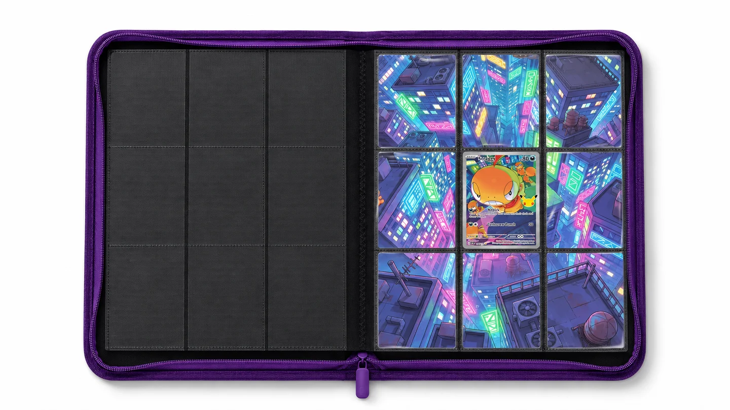
Build the whole page around one card you love. On a nine-pocket page, the centre position gives you an easy starting point, with artwork in the eight surrounding pockets.
Use the card’s background as a colour reference. Pale blue scenery might work with clouds or water; warm orange tones could suggest an evening sky.
Keep the supporting artwork quieter than the card. The aim is to draw attention towards it when you open the binder.
2. A page for your favourite Pokémon
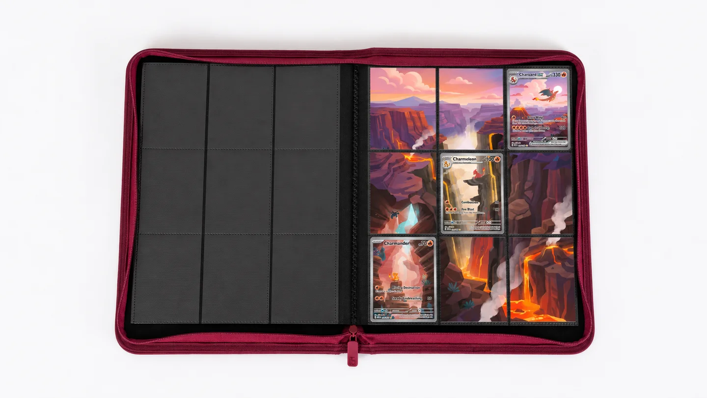
Bring together different versions of the same Pokémon: older cards, newer illustrations and less expensive favourites can all have a place.
Choose a shared colour or setting to connect them. You don’t have to include every card you own. Leaving a few pockets for artwork can make the selected cards easier to appreciate.
If the illustrations vary dramatically, try a restrained background instead of a detailed scene. It gives the page consistency without competing with the individual art styles.
3. A colour or habitat theme
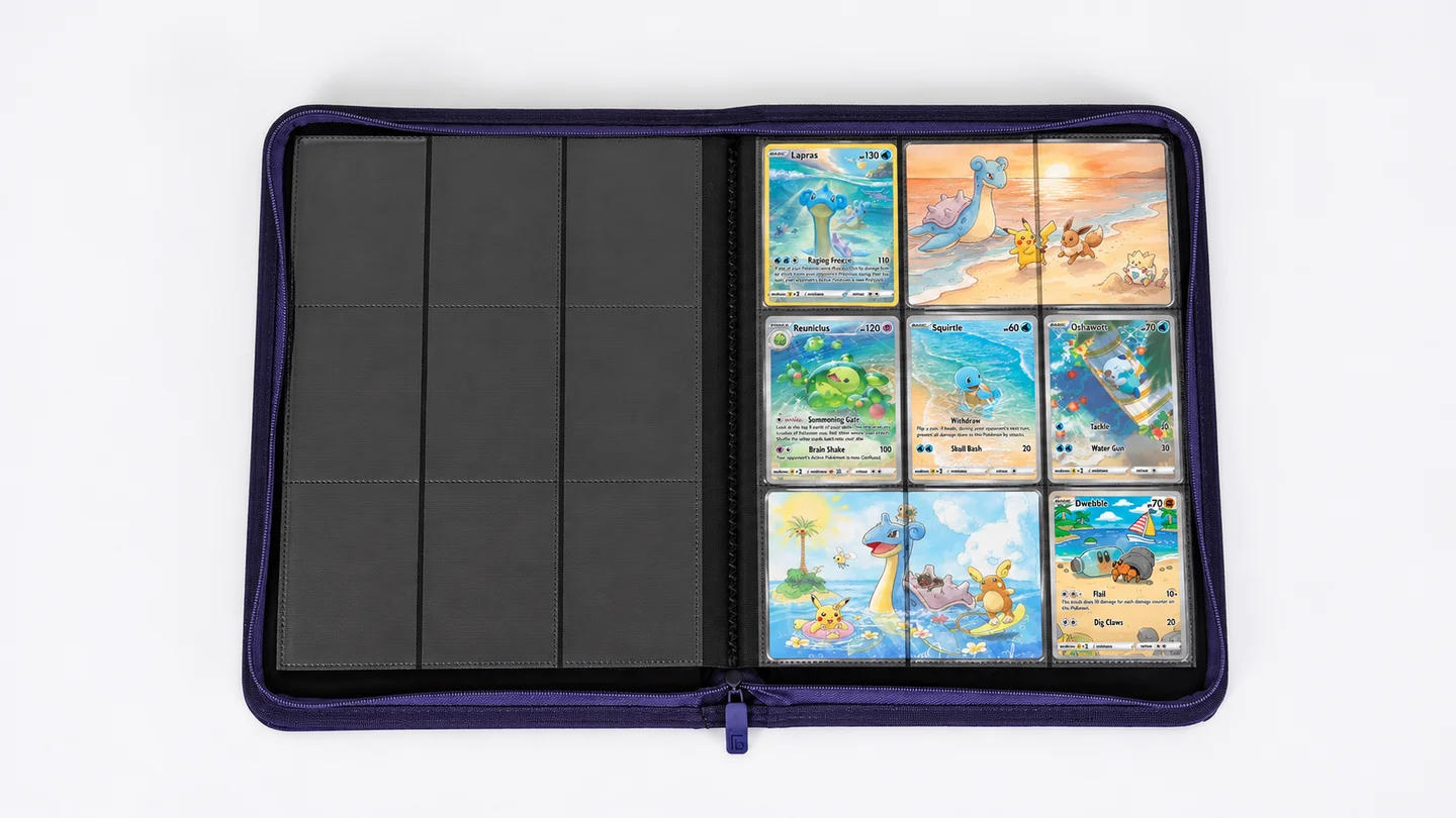
An ocean page can combine blue water, pale sand and underwater scenery. A woodland page might use leafy greens and earthy browns.
Select cards by what their illustrations show, rather than only by their printed type. A Pokémon resting beside a river could fit a water-themed composition beautifully.
You can carry the theme through to the binder cover, too. Consider Astral Vision for a dark/psychic project or Iron Root for a woodland collection.
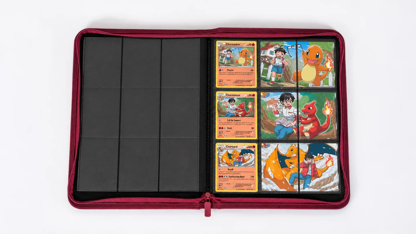
4. An evolution story
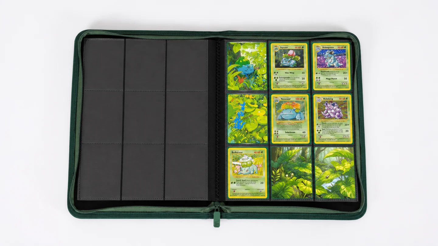
Arrange an evolution line so the eye follows it across the page. A three-card column leaves room for supporting artwork alongside it; a horizontal sequence can work within a wider layout.
Choose a background that supports that direction, such as a path or a gradual change in colour.
Start with the cards you own. They don’t need to come from the same set, and a shared scene can help connect illustrations with different styles.
5. A favourite illustrator
Look at the illustrator credits on cards you repeatedly stop to admire. Building a page around one artist can reveal connections you hadn’t noticed before.
The cards may already share enough visual character to hold the page together. Try understated inserts that borrow a background colour, leaving the illustrations themselves as the main attraction.
Check each printed illustrator credit before grouping the cards. Similar-looking artwork isn’t always by the same person.
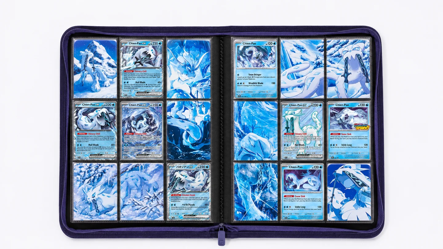
6. A coordinated two-page spread
Once you’re comfortable making individual pages, plan the two facing pages together. They could share one setting or show complementary scenes, such as a woodland in daylight and at dusk.
Treat the spine as a deliberate break. Keep important details away from it and preview both pages side by side.
Separate tiles can suggest a continuous scene without physically bridging the spine. Matching colours across the two pages is often enough to make them feel connected.
Templates, artwork and useful resources
A planning template and a cutting template do different jobs. A planning grid helps you choose positions. A print-ready template must also use dimensions that fit your binder and print correctly on your equipment.
Use the layout examples above for composition ideas, then measure your own inserts before making a print file.
This resource is a useful starting point:
Michi’s resource hub: the creator’s own links to help resources and the binder-making community.
Before investing time in any planner, check that it supports your grid and that you can adjust or verify the printed output size.
For background artwork, your own photographs and illustrations give you a personal starting point. Commissioned art or assets with clear reuse permission are other options. If you find something through an image-sharing site, trace it back to the original artist and check how it may be used. Keep a note of the source and any required credit alongside your project.
Common Michi Method mistakes and how to fix them
Most first-page problems are easier to solve with a small test than a complete redesign.
| Problem | What to check | What to try |
|---|---|---|
| Inserts are too large | File dimensions, print scaling and usable pocket space. | Adjust the dimensions and test one plain-paper insert. |
| The scene jumps at the seams | Whether pocket gaps were included in the plan. | Preview the artwork with the actual spacing represented. |
| Printed artwork looks blurry | Source image detail at the final print size. | Use a higher-resolution original or print a smaller area. |
| The page feels busy | Strong colours and details competing with the cards. | Simplify the background and choose a clearer focal point. |
| Colours look disappointing | Paper settings, ink and the difference between screen and print. | Test a small colour sample on your chosen paper. |
| A pocket bulges or a page resists turning | Insert size, paper thickness and stacked materials. | Remove excess material; use a thinner or smaller insert. |
Save an editable copy of the design and record the measurements that worked. When you return to make another page, you’ll have a useful starting point instead of repeating every test.
Frequently asked questions
Do I need expensive Pokémon cards?
No. Choose cards you enjoy looking at. Shared colours, interesting backgrounds and thoughtful placement can make a page appealing regardless of the cards’ market value. Start with your existing collection before buying cards specifically for a layout.
Can I use a twelve-pocket binder for the Michi Method?
Yes. Plan for its four-column, three-row arrangement rather than copying a nine-pocket design unchanged. Paired focal cards and offset layouts are useful starting points. Check the actual pocket arrangement before preparing your artwork.
Can I make inserts without owning a printer?
Yes. Prepare a correctly sized file and use a local or online print service. Ask them to preserve the intended dimensions and request a small test print before ordering the full set. You’ll still need to trim and test-fit the pieces.
Should artwork inserts go inside sleeves?
They can, provided the paper fits comfortably. Sleeves change the size available for the artwork and may change the appearance of reflections or borders. Choose your setup before measuring. Keep your collectible cards sleeved separately.
Can I mix Michi pages with a regular collection?
Absolutely. You could add a themed opening spread, dedicate a section to favourite Pokémon, or keep a separate display binder. There’s no need to reorganise a complete set just to try one creative page.
Updated